it's my first
feedback pls
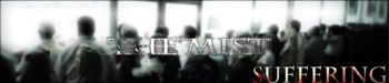
COLORFUL BOX
Forum rules
Please observe the following unique rules for this forum:
Please observe the following unique rules for this forum:
- Please limit your new threads (not replies) to one per week. If you have several new videos to announce, create one thread for all the videos. (Note: if you forget one you can edit your post!)
- Offsite links are allowed, but you are required to have a catalog entry for that video as well. Threads announcing videos that do not contain a catalog entry will be moved to the Awaiting Catalog Entry sub-forum and will be deleted in 2 weeks if an entry is not created.
- When posting announcements, it is recommended that you include links to the catalog entries (using the video ID) in your post.
- Videos that do not contain anime are allowed to be announced in the Other Videos section and are not required to have catalog entries.
-
Fall_Child42

- has a rock
- Joined: Wed Aug 11, 2004 6:32 pm
- Status: Veloci-tossin' to the max!
- Location: Jurassic Park
Re: COLORFUL BOX
When I saw Original animation, I was hoping for something different then a title card and some 3d motion.
I was totally going to offer you a bunch of advice, but because it's a small thing where you are fooling around with after effects I don't have the knowledge to do so.
Here are the things I noticed could be improved.
The sound effect for the jumping word was not appropriate. The word jumping shouldn't have individual shaking letters if it's going to move as a solid unit regardless Something more organic would have looked better.
The box was colourful.
the edges of the glowy bits extend over the box so during the rotations it's very ugly and 2d looking.
the letters need depth.
With all this I think It's great you are messing around with this stuff, and you should keep at it! It certainly has promise!

-
pharaoh

- Joined: Thu Jan 17, 2008 5:01 pm
- Status: watching
- Location: Egypt
Re: COLORFUL BOX
thanks man that was very helpfulFall_Child42 wrote:When I saw Original animation, I was hoping for something different then a title card and some 3d motion.
I was totally going to offer you a bunch of advice, but because it's a small thing where you are fooling around with after effects I don't have the knowledge to do so.
Here are the things I noticed could be improved.
The sound effect for the jumping word was not appropriate. The word jumping shouldn't have individual shaking letters if it's going to move as a solid unit regardless Something more organic would have looked better.
The box was colourful.
the edges of the glowy bits extend over the box so during the rotations it's very ugly and 2d looking.
the letters need depth.
With all this I think It's great you are messing around with this stuff, and you should keep at it! It certainly has promise!
i'm not gona redo this one but i will consider
the depth next time
-
Brad

- Joined: Wed Dec 20, 2000 9:32 am
- Location: Chicago, IL
- Contact:
