(I just hope this is in the right section... or should it be in Feedback? Saaa...)
Well, I finally decided to make a banner making guide. It's because, admit it, we have many great AMV-making guides, but no banner-making ones, which is a pity, because the banners make our site too.
And, to be honest, sometimes I feel sad when I have to click "Unworthy" on a banner which has great idea but has issues in quality...
This "guide" will be about PhotoShop mainly, I work with CS2 but I suppose most of it you can do in CS3 as well (haven't tried it yet, so can't tell for sure, though). It's without pics, but I can add them if there will be a need for them.
So, let's start.
First, get source materials.
You will need PS CS2, obviously, then the source logo from this page and then probably some picture for the character/background.
For the logo, I usually work with .tif file now (before I worked with .psd template), so I will explain it for that, you can get it.
For the picture part, always get the best resolution picture you can get. Can you get 2, 5, 10MB scan, 2*5 thousands of pixels? Get it!
The best pages I am used to work with are moe.imouto.org (the searching is a pretty tricky there, though) and AnimePaper.net (scans and wallpapers - I have seen some of them used in the banners... but the site has contribution system). You can also try MiniTokyo.com and others, but try to aim for quality. It's worth it.
You might want to use some brushes too. If so, find them, I suppose if you want to use them you already know how, so I won't mention them much
Now we process the materials
This part is actually pretty easy in the most times, mostly you can use the character with the background. Or there is no background at all (f.e. in vectors).
But, let's say you resized it (we'll do it in the next step) and the BG doesn't fit. You have now three options:
- mask it. If it's only a little corner, you can put something over it (logo, anyone?). I have never used this one, though, but I guess you can succesfully use it.
- redraw it. Easier when it's a little piece of solid colour, harder on patterns and such, hell on difficult sceneries where you can't use clone tool. This one is probably the most time-taking part of making banners.
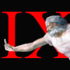
Few examples I have done, from easier to hardest:
Easy rebuild. I just prolonged the line, used selection tool and simply copied it (Ctrl+C, Ctrl+V)
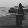
Another prolonging example (nevermind that Kyon there), same technique, just made sure the pattern doesn't repeat too regularly)
And probably the hardest two so far... In these, you can actually see why big source picture is good. The cloud circle patterns in the first one and the branches on the left in the second one were copied from other parts of picture. Just make sure there isn't any visible cut when doing this. Blur tool and Smudge tool are your friends here
Of course, redraw it when resized, if you aren't masochistic/really picky. And if you can't (small source picture,...), you can always
- crop it out. In here, again it's better to work with large scans, mainly because you can do a 2 pixel mistake and it won't be visible after resizing.
One advice here. Forget about Magic Wand tool or simmilar choosing techniques. You have two main options in here - Polygonal Lasso or Pen Tool. I would reccommend the first one for the beginners, as it is simplier and you still can get awesome results with it. The thing is - you can always do the selection better than the programme (supposed it isn't black/white pic only or something). Take your time and choose the selection you want in your banner, then cut it out and put in the banner file or new picture file (Ctrl+X, go to the target file (banner, new one), Ctrl+V). If the source picture is small, then zoom in and work the same but a little more carefully. 200-300% zoom should do for most people (I am nitpicker, so I work at 500% usually, but that doesn't count).
Starting it up
So now we have the materials ready. Now is the time to open a new PhotoShop file with settings on 468*60 for sizes and 72pixels/inch resolution (hope this is right), which is usual web setting. If you plan to make banners often, you can save it as preset, it's useful.
As a first thing, save the .psd. You don't want it to crash down and lose the data, do you?
Next thing, press Ctrl+Shift+Alt+N, aka, make a new layer (one of the most useful shortcuts ever). Never work on the background, that is basics. You sometimes won't need this new layer as all things will be copied in, but prevention is important.
Creation
Now let's get to the main point, and that is the creation itself. Open the source .tif file. You should see it has five layers. Select them all (by clicking the first one, and then pressing Ctrl+Shift and clicking the last one. Or you can just hold Control and click them one after another) and drag them to the window with your (so far empty) banner frame. You now should have 5 more layers of logo in your banner file - and you will see the logo is pretty large, so we need to resize it.
Control you still have all the five layers selected (important!), press Ctrl+T and you'll enter free resize mode. Press and hold Shift and drag one of the corners, it should resize while constraining proportions. If you don't want that, just leave the Shift key piece out. You can also rotate it now, so if you want to, you can. After you are satisfied, double click it.
You can now edit it, I reccommend some opacity playing, overlaying with colors and other funny stuff, to fit to your colour scheme and such. This can be done after the next part, of course.
Where you enter the BG picture just the same as above (it's just one layer, so you can usually go with (in the picture file) Ctrl+A, Ctrl+X, switch to the banner file, Ctrl+V, Ctrl+T (resize, turn,...), double click it). Your picture layer should probably be under the logo layers here.
If you are adding a background, make a new layer under the picture one (Ctrl+Shift+Alt+N, remember?) and work on it, so you don't destroy the picture itself.
So you have a picture now, it's time to add some effects and font.
For effects - background ones go between picture and background, picture ones go between picture and logo, frames usually go on the top of all. Try to be creative, work with brushes, opacity, colors, copy interesting shapes,... This is the most original part of your banner, so you might as well spend a while on it. You can of course go with a white background too, if you feel it's the best.
For the font - try to be reasonable. If you use Arial, it will be too simple, if you use a font with millions of curls, it won't be readable. For getting some fonts, try typing "free fonts" in Google and enjoy browsing them. Every maker has some favorites, but changing fonts is good. You won't have to be known as "the guy who uses Dungeon on all his banners".
For fonts effects - again, reasonability. The colour should be fitting to the banner (not for surrealistic ones) - I have seen many banners where the colors just blended into the background - and it should be readable and well balanced. If you don't know, white 2-3 pixel stroke usually works pretty well (in Blending options after right click on text layer), although there might be better options, of course. Try not to leave huge spaces on the banner, try not to have it overpacked. Of course, this is all mainly reccommendation, you can have the banner empty intentionally, etc... But if not, try to keep it nice and in the way watcher doesn't have to look half a minute for the text. Banners should be (not the case of gifs) "absorbed" in a short period of time after all, they shouldn't be a puzzle.
And finally, you may notice the logo and the picture kind of get blurry after resizing - so you might want to use Sharpen Tool on them. Try not to overdo it, though. You can Sharpen the logo layers one after another or you can merge them (select all of them, right click, Merge Layers). But be aware that you can't simply unmerge them after (other than going back, which deletes the sharpening as well)!
Saving
So now we have final .psd file, all shiny and ready to go. Save the .psd and for the final output, click Save for Web.
Here, you have few windows with previews. I will go through the choices now.
- jpg. Use this, when the banner has many colours, which kinda merge one into another (examples:1, 2). Use .jpeg setting, High choice, Optimized and slide the quality as high as possible till you reach 20kB (usually about 75-85, depends on banner)
-gif. For gif, you want your banner to have as many large color blocks as possible. Of course, you have to use it if you want moving gif as well (I won't run in that one here). You can also use it when you see there are really few colours in the picture (examples:1, 2).
For settings - set Colors to 256, transparency on, matte either white, or if you have dark background, you can choose its color manually, Interlaced on (makes them easier to load on the org page). The others are optional, play with them (Selective/Perceptual/... and Dither vs No dither) - they depend on every picture, so run through them and see what looks the best.
Now, if the filesize is too hig, manually lower the number of colours untill you get under 20kB, which is one of the options (and I use it the most) to get it nice. Don't switch to 128 straight (untill it's either from few colors (monochromatic pictures) or big even on 128 - and in the latter case something is probably wrong).
- png. This is good for a mix of the above things. You should use 8bit version, as the 24bit one gives too large results. I often use these instead of unmoving gifs as well. Keep the interlaced option on again.
- For more about gif/jpg problematics, go here. The most banners which had these problems were with the last logo, where they were sometimes clearly saved as jpgs while they shouldn't have been, it pixelated the flower part (which was solid block of color with another color around - problem for jpg). With the 2008 logo, it gets somewhat better, but it's still here.
Now, we are at the end. I hope it helped you in something and that I wasn't wrong somewhere (if so, excuse me - and say so, so I can fix it). Also, if you have some questions or something, ask away! I can probably answer things about PhotoShop, about using something in MSPaint (if someone seriously uses it) and few of my friends use InkScape and GIMP, so I might ask them if you want the advice in those (and there are hopefully banner makers here working in these programs who can help you in this thread)
And make banners. You get better with making them :+)
Ja ne o/
Simple banner-making guide for beginners
-
Nya-chan Production

- The :< point of view
- Joined: Wed Nov 15, 2006 11:21 am
- Status: White bracelet
- Location: Ward 7F
- Contact:

-
Nya-chan Production
- The :< point of view
- Joined: Wed Nov 15, 2006 11:21 am
- Status: White bracelet
- Location: Ward 7F
- Contact:
-
Emotive
- ...the Meditant
- Joined: Sat Nov 04, 2006 12:20 pm
This would be better off be called a simple banner-making guide with Photoshop.. Photoshop is not the only image-editing program out there, not everyone can afford it and this site doesn't encourage other ways of getting an expensive program you may want while it does encourage getting a free alternative.You will need PS CS2, obviously, then the source logo from this page and then probably some picture for the character/background.
So I wouldn't say you "obiously" need photoshop, when there are other image editing programs out there, free or not. Which does affect your guide, making it a banner making guide for photoshop users only..
Don't think it's a bad guide, but that's my main complaint with it. I'm not saying you should have made a guide for every program out there, but you should at least state it in the title ;]


-
Nya-chan Production
- The :< point of view
- Joined: Wed Nov 15, 2006 11:21 am
- Status: White bracelet
- Location: Ward 7F
- Contact:
@Nurse Grenade:
Oh, nice point there, should've put it there. Well, little late now ^^;; Even though I think this can help many GIMPers as well, as the tools and layer-work are pretty simmilar, iirc (but the shortcuts are not).
The main thing I worry about anyway is that the most banner-makers won't even see this thing.
@MrDoctorWithLongName:
Indeed. If only the saving options didn't suck that much ><

-
JaddziaDax

- Crazy Cat Lady!
- Joined: Tue Mar 16, 2004 6:25 am
- Status: I live?
- Location: Somewhere I think O.o
- Contact:
-
Nya-chan Production
- The :< point of view
- Joined: Wed Nov 15, 2006 11:21 am
- Status: White bracelet
- Location: Ward 7F
- Contact:
Well, in fact, there are pretty much differences.
First, you'll probably save the big source png image and save it to bmp, because you'll meet some obstacles when using png or tif (like opacity, etc). FastStone ImageViewer is nice for this, f.e. (Google it)
Followed by deleting the colour around the logo, resizing it (with another type of resizing, in percents) and then adding the background and font. Or you can do it the other way and import logo in the picture. I think this year it's pretty hard, though, lot of "dirt" around the logo itself (notes and such).
And in the end you save it and hope it stays the way it was when you made it ^^;;