you know what sucks about the word filter?
I can't go YOOOOOOOOOOOOOOOou
but aside from that there are a few things i want to say about this video.
first the bad.
The red text was really poorly done, it looked way out of place ... something more needed to be done with this advertorial text to make it look like it should be there instead of was stuck on top.
The Ghost buster logo (that was awesomely modified btw) kinda appeared randomly throught the whole thing... i'm not sure what the zoom fades really had to do with anything they were kinda random)
some of the actual beat synch hard cuts, seemed off.
Now the good,
Thank GOD people are doing original things. I like this, keep doing things like this ... seriously.
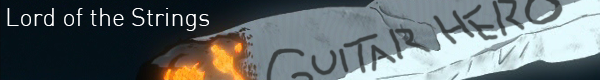
The magazine covers, stories, and TV bits all really well done, formated and coloured just like the media you were trying to parody.
they fit really well into the video. (I kinda wish you had the text in the magazines say things though... little bit of detail to make those paying attention feel rewarded

)
Some of the compositing was AMAZING the ghost busters sign ... the stay puff marshmallow man on the cell phone etc.
i give this 0.837413 / 1


 )
)